About this website

In printed books a colophon is a brief description of the printing and publication of the book, giving information such as the date and place of publication and the name of the printer.
In the information age a similar principle may be applied to websites, in order to provide data about the standards, technologies and assets used for a site’s construction.
Standards compliance
We adhere to modern best practices.

The site is written in HTML5 with Cascading Style Sheets (CSS). The foundation for the site was derived from version 3.0 of the HTML5 Boilerplate project. Grid layout styles have been derived from the Adaptive CSS project providing a standardised grid system configured to operate at several different screen widths.
This site was developed primarily using Google Chrome and makes use of many modern techniques that are at a designer’s disposal today including CSS3 gradients, transparency, animated transitions and shadows.
Browser support
One for all and all for one.
There is only one version of the site. We do not perform any clever backend work to deliver altered markup to specific browsers, mobile devices or internet refridgerators. What you get is what everybody gets — it’s up to your browser to decide what to do with it. This is the way the web is supposed to work.

The site has been tested using the latest version of Mozilla Firefox (at the time of writing, version 10) as well as the popular 3.6.x series, the latest versions of Google Chrome and Safari, and Microsoft Internet Explorer 9, 8, 7 and 6 — though if you’re browsing with IE6, you’re going to be nagged to upgrade!
We have also tested several mobile browsers on iPhone and Android platforms, including Mobile Safari, the stock Android browser, Firefox for Android and Dolphin.
Additionally, the site has been tested using the VoiceOver and ChromeVox screen readers. We have not been able to test the site with JAWS due to the commercial nature of the product. Please let us know if there are specific issues that you encounter while using screen readers and we will endeavour to correct them.
While the user experience is not identical in every browser, it does not vary significantly and gracefully degrades where browser features are not available.
About the imagery
The world is full of talented and generous photographers and illustrators.
The photographs used as banner images on some of the pages are subject to Creative Commons licensing terms. We’d like to express our thanks to these people for providing some fantastic images while licensing them in such a way as to allow us to share them with the world.
The following images are licensed under Creative Commons licenses:
-
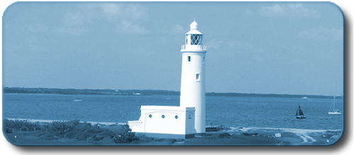
 North Head Lighthose by Cape Disappointment. © 2009, Xan Fulton.
 -
 DNA Molecule display, Oxford University. © 2007, net_efekt.
 -
 Clouds. © 2011, theaucitron.
 -
 Writing Apparatus. © 2010, Kaushik Narasimhan.
 -
 Puzzle pieces. © 2008, Liza.
 -
 Half-open door to Heaven. © 2010, Klearchos Kapoutsis.
 -
 Warmups. © 2008, Martin Cathrae.
 -
 Hot Air Balloons. © 2011, Lee.
 -
 Keyboard. © 2011, David Francis.
 -
 HTML5 Logo. © W3C.
 -
 Iconic open source icon set. © P.J. Onori.
The following images are copyright free, but are cited here for completeness:
-
 HAL 9000 Lens. 2008, rg1024.
 -
 Rose of Galaxies. 2010, NASA, ESA and the Hubble Heritage Team.
 -
 The Noun Project icons.
About the typefaces
Extra, extra, read all about it!
The typeface used for headings and titles is Sawasdee by Pol Udomwittayanukul from the Fonts-TLWG (formerly ThaiFonts-Scalable) collection. Sawasdee itself is licensed under the GPL version 2.0 with an exception for usage for embedding the font into a document. If you want, you can read the full license text.
Body text is displayed using Quattrocento Sans by Pablo Impallari, licensed under the SIL Open Font License 1.1.
Both Sawasdee and Quattrocento Sans are served using CSS3 Fonts Module techniques supported by all modern browsers.
Navigation and footer elements are displayed using whichever modern sans serif font is installed on your system — in order of preference: Helvetica Neue, Arial, Helvetica, Nimbus Sans L, Liberation Sans or FreeSans. Where small type sizes are used, fonts known for their clarity at small point sizes are used instead — in order of preference: Helvetica Neue, Verdana, Bitstream Vera Sans, DejaVu Sans, Tahoma, Geneva or Arial. None of these fonts are served using CSS, so if you don’t have any of them installed, such text will be rendered in your browser’s default sans serif font.
Technology behind the scenes
We write open source, we use open source.
While the site is ultimately served as static HTML and CSS documents, it is generated from templates written in Haml, Markdown (or, more specifically, using a superset of Markdown known as kramdown) and erb.
We use nanoc to combine the consituent parts (document structure, textual content, images, styles and scripts). We run this on a Linux-based staging server under version 1.9.3 of the Ruby language.
Stylesheets are crafted using Syntactically Awesome Stylesheets (Sass) and bespoke JavaScript is written predominantly in CoffeeScript. These technologies are simply a pleasure to work with as they act to reduce the usual verbosity and complexity of stylesheets and scripts.
Enhancing the user experience.
The site uses the jQuery library and several jQuery plugins to enhance the browsing experience. The jQuery plugins used are:
- ColorBox — a lightweight customizable lightbox plugin, used for displaying screenshots.
- EqualHeights — set specified elements to the same height, used to keep the panels and vertical separator lines looking good.
- jQuery.popeye — an advanced image gallery script that saves space and doesn’t break page flow, used to display smaller rolling screenshot slideshows.
Additionally, the site uses the Modernizr library to perform feature detection and the Respond library to provide a CSS Media Query polyfill for older browsers. Media queries allow the site to use different styles when being displayed at different widths so, for example, the same markup and stylesheets can be used for browsers on mobile devices as well as desktop browsers. Media queries also allow the site to look better on larger screens as styles can be designed to properly consume the larger amounts of screen real estate made available on such displays.
Finally, to try and bend Internet Explorer to our will a little more, we make use of the CSS3 PIE library which aims to allow various CSS3 features to be supported in Internet Explorer through the use of Microsoft’s bespoke DHTML behaviours feature. This is used, where possible, to generate rounded corners for those unlucky few who remain trapped in the clutches of Internet Explorer!
Wrapping up
We like technology — moreover we like technology used well.
Websites can be overcomplicated. They can be all-singing and all-dancing affairs that do much more than simply get the message across. Like everything we do at Alces Software, we try to retain simplicity while not compromising on effectiveness.
Ultimately, technology is all about getting things done. Let’s go and do some more.
Thanks for reading.
The Alces Software Web Team.

